Posts

Portfolio

Image
  Artist Statement Assembling the final project for this semester feels very rewarding. I feel very accomplished being able to see all my work displayed in an orderly manner and alongside each other. For my colors, I used two of my previously selected colors from the BW color logo project. I also incorporated the intricate and elegant design elements from the Propaganda Poster project. My personal favorite part of this project was how I included the "behind the scenes" sketches on the "About" page. I think it's unique, fun, and adds something personal to my portfolio. Overall, I think it's impressive how this course was able to go through all these Adobe Programs so thoroughly and with so many assignments and projects. I close the chapter on this semester on a good note and with my goal met, which was to build a bigger portfolio and gain more experience.

Business Card

Image
 Sketches Final Images Artist Statement My business card project builds of a previous assignment that we completed in this course. The BW in color logo served as my focal point in completing this project. I knew that my potential business card would represent me which is why I made my personal logo the focal point. I incorporated some pre-planned design elements form my sketches, yet as I continue to get engulfed by this assignment, I strayed from most of my original plans and added more details as I designed. I followed the provided tutorial to ensure that I completed what was necessary as well as started and exported the document properly. Overall, this was a very fun assignment which I enjoyed getting lost in.

Post Card

Image
 Final Postcard: Artist Statement: To begin my Postcard project, I used my Illustrator Self-portrait final image for the requested main image. The most difficult part of this assignment was making sure that the initial measurements were correct and following the guild lines, as well as the exporting package instructions as I had never done that before. I used the shape line tool to draw out the lines on the back of the post card and I included my Tag brush logo. For the location I picked Paris, France as that is where Marrie Antoinette was queen and that was the theme of my Self-Portrait project. Overall, this is a very simple yet good introduction towards working in Adobe InDesign.

Id HW #1

video 1      This fifteen-minute tutorial provides a run-down of the basic and most frequent function that Adobe InDesign has to offer. The author of the video goes into quick detail on how to open the program, place content on the page, and completed the tutorial with a finished layout to demonstrate how easy and assessable this program is.       Tools that I find easy to use are the Window panel functions such as layers, selection tool, and the text panel. I also found useful the tips and tricks on how to operate in pages as layout making it the primary purpose for this program. What I find potentially difficult for me is the grids. I am bad with measurements, and I feel like I would be a bit confused on where and how to place them. video 2     This is a fun, entertaining, and beginner friendly fifteen-minute video featuring different InDesign tips and tricks in alphabetical order. Starting from the definition of Autosave to the Zoom t...

Animation

Image
Final Animated GIF Original Image used Artist Statement  For this animation project I illustrated and animated a fish with bubbles. I was inspired by the Goldfish cracker stop motion animation seen in advertising. The title of my animation is "Don't burst my bubble", I thought it was a clever play on words that fits with the animation at hand. For this assignment I followed the tutorial provided as well as a few from YouTube which helped me get specific help in the areas that I was confused on. This is my first time utilizing the frame animation panel in Photoshop therefore I wanted to try making something simple since I am a beginner in this section of the Adobe Programs. Additionally, I was not able to fully complete this project as I have a family emergency and would not be able to get additional class help. I did submit what I had completed despite it being shorter than required and partially complete.

Somewhere

Image
 Original Image Image of myself Final image Artist Statement For my "Somewhere" project assignment I decided to insert myself in the scene from The Walking Dead. I thought it would be fun to become part of a zombie herd as the show itself has hired fans to be zombie set extras. Conveniently enough I had a recent photo of me looking down which I thought was perfect for the original picture selected as the sun and shadows were coming from the same direction. I did not follow any tutorials on how to complete this project, instead I wanted to apply what I had recently learned from the in-class tutorials. I used the Object Selection tool to isolate myself from the background of my image then I did the same to the central zombie and arranged the layers so that I am approaching from behind him. I then worked with the Object Selection tool, Clone Stamp tool, Layer masks, and Overlays to give myself a decaying look.

Ps HW #3

Image
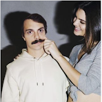
 1) An image that would be really hard to Photoshop myself into: Out of all the authors works I feel like this would be difficult to Photoshop myself into because Kendal Jenner's hand is touching the face. As well as the model poses while "pulling" on his skin which means that the editing had to be more precise in that area in order to make it believable. 2) An image that inspired me or gave me an idea for the "Somewhere" project: This image gave me inspiration for my future "Somewhere" project! I find it inspiration in it because I like how his edit looks very animated. This made me realize that it is more fun to try and make my project less realistic. 3) An image that makes me laugh: This image made me chuckle because the editor took the Photoshop request in a very literal sense. Plus it looks like it was easy and quick to accomplish which adds to the humor. 4) An illusion that I might want to recreate: I found this illusion impressive and I liked ho...

BW to Color

Image
Original        B/W to color Artist Statement: For this assignment I used the photo of myself that I took enjoying nature. Because of this, when choosing what parts of my picture to change the color of I wanted to focus more on the background. In one of the color variations, I tried a more conventional approach that was presented in the video and changed my hair and jewelry. But, for the other ones I wanted to abstractly shift the colors in the background. My thought process was to make the spotting in the sky and tree behind me to look like a virus almost, sort of like the particles in the nature are absorbing into me. From color.adobe.com I selected the color rules that were appealing to me.

Tag brush Logo

Image
B/W AI logo: Tag brush PS logo: Artist Statement: Similar to the logo design that our class has worked on, this assignment focused on making a signature for your work. I utilized the logo that I previously made and worked on it in Photoshop. By applying through layers the brushes that were provided to us, the end result mimics graffiti.  I find it cool that we make it look like an actual graffiti artistic tag as it brings the real words into the digital one. For my colors I used black and pink as it is my favorite color combination.  This is a good and important stepping stone assignment to get familiar with this new and different program. 

Ps HW #2

https://youtu.be/KAmSB5MQxOo?si=pIeGI-WZNcMbrtjO     This video is a quick five-minute beginner introduction to the Photoshop program. What I find difficult in this video is working in layers since it is different from Illustrator. What I find easy in this video is how to use the image adjustments since it is just a button in a panel. What I found interesting in the video is the explanation between what saturation and vibrance is. I see it as something that I would use when wanting to professionally edit an image. https://youtu.be/No8dH1mLVu0?si=pHMQ_shHmZwbOwU5        This video is a 13-minute tutorial on the basics in the  Photoshop application.  What I find easy in this video is brush tools. They seem pretty self-explanatory  and mimic real life which I find understandable. This application is more manual so I feel like it might be easier to use as you actively have to bring the brush across the picture if you want...

Ps HW #1

Image
From the "The People's Portfolio" what brought me close to my emotions are the photos from the "Rights in Russia" photoshoot. Specifically, the photo that features Natalia Voronitsya laying down on a couch with her computer on her lap and the medication on the side table in the background.  I like this photo because it is one of the more creative ones in this collection. The placement and composition stood out to me which is why I clicked on the photograph to explore it closer and learn more about the story behind it.  The tragic and unfortunate occurrence of her condition partnered with the look in her eyes and expression made me feel deeply for her. The caption perfect described her with the word "confined" which added to the power behind the image.  Natalia's face has a hopeless look while also having her laptop open which shows that she is simultaneously trying to do something. Yet the screen isn't on and it's black and matching the emp...

Self-portrait Poster

Image
     Final image of poster      Final image of portrait      Original selfie used for self portrait Inspo Images Artists Statement For my Self Portrait Propaganda poster project, I wanted to recreate the infamous Marie Antoinette quote. During the French Revolution she was ignorant of the working classes despairs and allegedly said "Let them eat cake". However, over time that has been disproven and considered as fake news spread by gossip at the time. I was inspired by Sofia Cappola's autobiographical movie on Marie Antoinette. In the movie there is a scene where Marie is discussing with her servants some of the dramatized nonsense that is being spread in her name, one of them being "Let them eat cake! that's such nonsense I would never say that!" I thought it would be a clever hidden message to include in my poster, to symbolize being yourself and not let other people's opinion bring you down because people are going to talk about you r...

Logo

Image
 Sketch Final B/W Version Color Version Artist Statement      For my logo assignment I wanted to incorporate my initials into the design. Since all three of my name initials start with the letter "M", I eliminated the sketch ideas that had the letter repeating.  I feel like the name that we are given at birth can steer our fate to a certain extent. I wanted to include my initials in a circle shape to mimic a wax seal stamp. Wax seals used to be an identifiable family symbol, and a direct and final signature from an individual when writing a letter. Because of that I think it would be appropriate to theoretically tattoo on my forehead.  By playing around with the brush stroke options, I landed on the one that looked artistic, not linear, and mimicked ink (especially in the B/W original black and white version). The three colors I selected were inspired and play upon my character. My hair has orange undertones. Pink is associated with sensitivity, playfulness...

Calligramme

Image
 Artist statement My calligramme project is made of text from a letter to my future self in 20 years. The general theme behind my letter is about "writing your own narrative" and being in control of your own life to the point of feeling satisfaction. For my illustration I chose to do an ancient scroll with a quill. To imitate a letter within a letter. I hope my work inspires others to not be a passenger in their own journey, but instead the driver. As it serves as a reminder that you are the one holding the quill and writing the story of your life. As instructed, I utilized the pen tool to draw out the sketch and then the different variations of type tool to apply and insert the text to make my calligramme.

Ai HW #1

(3) Adobe Illustrator for Beginners: Get Started in 10 Minutes - YouTube   This video is a quick ten-minute summary about Illustrator tools. Then the author does a run-down of vector vs raster images and how to get started in the program. He then goes over the basics such as the workspace, header, control bar, document tabs, and of course the tool bar. I feel like a difficult part is always starting, and that might be carried over to learning how to put in the correct preset details. If the measurements are wrong, then the overall project might be deemed as wrong (just from the way we started). I also find the direct selection tool to be a little confusing and intimidating since it contributes to so much movement. What I find interesting about this video is how well done the formatting is, I see it as a very good and quick recap of the basics in illustrator. (3) Learn Illustrator in 5 MINUTES! Beginner Tutorial - YouTube This is another quick and well-organized beginner video. ...

Internet/ World Wide Web/ Wifi/ Bluetooth

Image
Internet / World Wide Web The internet is a connection of networks that is joined together through devices around the world. It was created, developed and improved during the course of many years and continues to be worked on to this day. The Cold War era introduced the usage of satellites and forming connections through space. In 1957 the launch of the Sputnik satellite by the USSR prompted The United States as well as other countries to consider their options of increasing the power of digital connections.   Although several inventors and scientists contributed to the concept of the internet with technologies leading up to it, Robert W. Taylor has been credited with developing an early prototype of the internet called ARPANET. Originally it was used to connect computers in universities and labs but now it has evolved into being utilized everywhere! From advertising and social media to military operations and scientific research. The World Wide Web is an extension of the internet....