Posts

Portfolio

Image
  Artist Statement Assembling the final project for this semester feels very rewarding. I feel very accomplished being able to see all my work displayed in an orderly manner and alongside each other. For my colors, I used two of my previously selected colors from the BW color logo project. I also incorporated the intricate and elegant design elements from the Propaganda Poster project. My personal favorite part of this project was how I included the "behind the scenes" sketches on the "About" page. I think it's unique, fun, and adds something personal to my portfolio. Overall, I think it's impressive how this course was able to go through all these Adobe Programs so thoroughly and with so many assignments and projects. I close the chapter on this semester on a good note and with my goal met, which was to build a bigger portfolio and gain more experience.

Business Card

Image
 Sketches Final Images Artist Statement My business card project builds of a previous assignment that we completed in this course. The BW in color logo served as my focal point in completing this project. I knew that my potential business card would represent me which is why I made my personal logo the focal point. I incorporated some pre-planned design elements form my sketches, yet as I continue to get engulfed by this assignment, I strayed from most of my original plans and added more details as I designed. I followed the provided tutorial to ensure that I completed what was necessary as well as started and exported the document properly. Overall, this was a very fun assignment which I enjoyed getting lost in.

Post Card

Image
 Final Postcard: Artist Statement: To begin my Postcard project, I used my Illustrator Self-portrait final image for the requested main image. The most difficult part of this assignment was making sure that the initial measurements were correct and following the guild lines, as well as the exporting package instructions as I had never done that before. I used the shape line tool to draw out the lines on the back of the post card and I included my Tag brush logo. For the location I picked Paris, France as that is where Marrie Antoinette was queen and that was the theme of my Self-Portrait project. Overall, this is a very simple yet good introduction towards working in Adobe InDesign.

Id HW #1

video 1      This fifteen-minute tutorial provides a run-down of the basic and most frequent function that Adobe InDesign has to offer. The author of the video goes into quick detail on how to open the program, place content on the page, and completed the tutorial with a finished layout to demonstrate how easy and assessable this program is.       Tools that I find easy to use are the Window panel functions such as layers, selection tool, and the text panel. I also found useful the tips and tricks on how to operate in pages as layout making it the primary purpose for this program. What I find potentially difficult for me is the grids. I am bad with measurements, and I feel like I would be a bit confused on where and how to place them. video 2     This is a fun, entertaining, and beginner friendly fifteen-minute video featuring different InDesign tips and tricks in alphabetical order. Starting from the definition of Autosave to the Zoom tool the video's author briefly and directly c

Animation

Image
Final Animated GIF Original Image used Artist Statement  For this animation project I illustrated and animated a fish with bubbles. I was inspired by the Goldfish cracker stop motion animation seen in advertising. The title of my animation is "Don't burst my bubble", I thought it was a clever play on words that fits with the animation at hand. For this assignment I followed the tutorial provided as well as a few from YouTube which helped me get specific help in the areas that I was confused on. This is my first time utilizing the frame animation panel in Photoshop therefore I wanted to try making something simple since I am a beginner in this section of the Adobe Programs. Additionally, I was not able to fully complete this project as I have a family emergency and would not be able to get additional class help. I did submit what I had completed despite it being shorter than required and partially complete.

Somewhere

Image
 Original Image Image of myself Final image Artist Statement For my "Somewhere" project assignment I decided to insert myself in the scene from The Walking Dead. I thought it would be fun to become part of a zombie herd as the show itself has hired fans to be zombie set extras. Conveniently enough I had a recent photo of me looking down which I thought was perfect for the original picture selected as the sun and shadows were coming from the same direction. I did not follow any tutorials on how to complete this project, instead I wanted to apply what I had recently learned from the in-class tutorials. I used the Object Selection tool to isolate myself from the background of my image then I did the same to the central zombie and arranged the layers so that I am approaching from behind him. I then worked with the Object Selection tool, Clone Stamp tool, Layer masks, and Overlays to give myself a decaying look.

Ps HW #3

Image
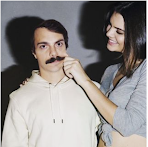
 1) An image that would be really hard to Photoshop myself into: Out of all the authors works I feel like this would be difficult to Photoshop myself into because Kendal Jenner's hand is touching the face. As well as the model poses while "pulling" on his skin which means that the editing had to be more precise in that area in order to make it believable. 2) An image that inspired me or gave me an idea for the "Somewhere" project: This image gave me inspiration for my future "Somewhere" project! I find it inspiration in it because I like how his edit looks very animated. This made me realize that it is more fun to try and make my project less realistic. 3) An image that makes me laugh: This image made me chuckle because the editor took the Photoshop request in a very literal sense. Plus it looks like it was easy and quick to accomplish which adds to the humor. 4) An illusion that I might want to recreate: I found this illusion impressive and I liked ho